PHOTOGRAPHY - PAINTING WITH LIGHT


Friday, 21 January 2011

London Art Fair 2011

We went down to the Art Fair held at The Business Design Centre in Islington yesterday.

It is a showcase for contemporary art work, including photography, with 124 galleries showing curated and solo shows.

There is a section for emerging artists in the 'art projects' as well as Photo 50, a showcase for contemporary photography.


Photo50 at London Art Fair

Photo50 is our showcase for contemporary photography.  Now in its fifth year it will feature 50 works by artists selected by a distinguished panel with both established artists and less well known figures.  This year’s panel includes Zelda Cheatle, Curator and Director of the Tosca Fund Photography Collection, Celia Davies, Head of Projects for Photoworks, Sebastien Montabonel, European Senior Specialist of Photographs at Phillips de Pury and Joanna Pitman of The Times. We asked each member of the panel to nominate up to three artists and then introduce their work.

A Photography Focus Day on Wednesday 19 January 2011 will feature a series of discussions and tours dedicated to contemporary photography.

  
Scarlet Hooft Graafland / Polar Bear / 2007 / C-print/ 100 x 125cm / Courtesy of the artist / Photo50 2011

Scarlett Hooft Graafland / Polar Bear / 2007 / C-print/ 100 x 125cm / Scarlett Hooft Graafland courtesy Michael Hoppen Contemporary


David Spero/ Studio 3/ Image courtesy of the artist

David Spero/ Studio 3/ Image courtesy of the artist


Bill Armstrong/ Renaissance 1005/ 2006-7/C-print mounted to aluminium Framed/ 76.2 x 91.4cm/ Edition of 5/ Image courtesy of the artist
Bill Armstrong/ Renaissance 1005/ 2006-7/C-print mounted to aluminium Framed/ 76.2 x 91.4cm/ Edition of 5/ Image courtesy of Hacklebury Fine Art
 

I couldn't resist taking this shot of the roof structure of the exhibition hall.


The works on display covered all artistic genres and no doubt we only saw a small proportion of those on display, it was fascinating and very inspirational.


Off the wall, you could say, I remember the flying ducks my mother used to have on her wall, an example of image manipulation.


This is photograph of New York which has been manipulated to reflect itself.


Here the artist has made a composite from iconic images from around the world. 


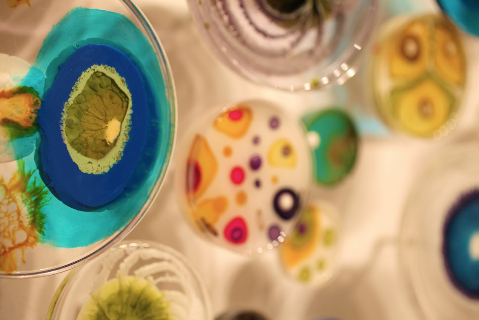
This is a beautiful wall panel made up of coloured blown glass, reminded me a little of the marbles I used to play with as a child, or the glass made by Murano glass works in Italy.


Some of the viewers were as interesting as the art works.

Since I am in the process of deciding how best to present my images, it was interesting to see the different treatments used at the show.

On the whole however, I found that most of the contemporary photography was presented  mounted behind a sheet of acrylic, this made some difficult to view since lighting reflected off the surface.

Wednesday, 19 January 2011

ARCHITECTURAL DECORATION (NAPLES ARCHEOLOGICAL MUSEUM)


Whilst in Italy visiting the National  Archaeological Museum of Naples, I was inspired to photograph many of the exhibits.  These help record the daily lives of the inhabitants of the surrounding area right back to Roman times.  Many of the exhibits were taken from Herculanium and Pompei, Roman cities of great sophistication, and show how people lived, how they decorated their homes and the items they used and treasured.

Since one theme of my assignment covers architecture, I thought I would include these since architectural decoration and detail is covered by this.  In addition I feel that architecture influences the way people live and inhabit a space, therefore this translates into the items they use in daily life and treasure for decoration.


This is a detail from a sarcophagus carved in the 4th centure AD, of Roman origin and shows very find detail.


This detail is taken from the so called 'blue vase'.  It is a wine amphora depicting a Dionysiac themed grape harvest, made by adding a layer of white paste to a blue glass background.  Locally made in the Augustan period, 1st Century AD.

This must be where Wedgewood got his inspiration for his Jasperware, paste cameos on blue unglazed pottery.

This shot was difficult to get since the vase was in a square glass case with four tungsten lights inside attached to the top, shining directly down onto the vase.  Great illumination for viewing but not for photographs.


This is a wall painting taken from a villa in Pompei of Terentius Neo (a baker) and his wife. It was found on the rear wall so that anyone entering the house had an immediate view of it from the atrium.

Below are further wall paintings taken from Pompei and Herculanium and show how wealthy Roman families decorated their homes.


These animal head spouts were taken from a fountain and must have looked very impressive when in use.

Since they were lined up on a plain wall I liked the idea of giving an impression of the spouts but concentrating focus on one, I therefore used a wide aperture on autofocus and then recomposed the shot.


This is a silver drinking vessel decorated with olives and branches from the House of Menander where a silver hoard was found.  There were 118 pieces packed in wooden cases in the basement of the house and were placed there during restoration of the villa, after damage during the earthquake of AD62.  They had been wrapped in cloth and wool for protection.


The figures of athletes below were most impressive since they were in running position and not the usual erect pose draped in robes and holding spears, shields etc.

They were recovered from the Villa of the Papyri, with another 65 works in bronze and 28 in marble and more than 1000 rolls of papyrus.  They decorated the gymnasium  at the centre of which was a swimming pool.

These were difficult to photograph since  I wanted to depict the running action but with the striking face in focus.  The large windows behind let in bright sunlight and there were constantly people milling about.  I got as close to the runner as I could and used a shallow depth of field to try and cut out some of the distractions.


The final shot is part of the museum building itself, the building was originally a palace, constructed in the Renaissance period and renovated and restructured by Ferdinand IV of Bourbon around 1780.


This is the Great Hall of the Sundial and was begun in 1612/1615 and was intended to house the 'Studi' and the public library, so called because of a sundial built into the floor, lit by a shaft of light which enters the room at midday, through a hole from the south-west corner of the room.

Tuesday, 18 January 2011

Research - Presentation 2

From previous research it is clear that if choosing printed images it is essential to ensure that the printer used is of sufficient quality, to make a faithful image of that seen on screen.

Most printers are either ink-jet or laser, ink-jet work by squirting minute amounts of ink onto the chosen medium, whilst laser printers use a xerographic printing process, the image is produced by a laser beam scanning across the printers photoreceptor.   The printers ability to accept a wide range of paper sizes and weights also needs to be considered.

Higher resolution printers will give better results with some printers able to produce up to 1440x720 dots per inch, (dpi).  However, the way in which the printer uses these dots has a significant impact on the printed image and it is better to compare results rather than the number of dpi.


Following the decision to print images, whether in house or using one of the many companies offering this service, the decision then has to be made as to what form final image will take.  Whether it be on canvas, contemporary acrylic or box framed.  It could also be presented on white card or mount board, fibre or foam board with various finishes.  Framing should also be considered and there are many types and sizes available.


Another alternative is to present as an album, see an example below:
PhotoCoverBooks
One Vision’s PhotoCoverBooks offer the photographer a unique way in which to present a photographic album. Photographic paper is widely recognised for delivering the finest quality of image onto paper. Therefore, as our core customers are professional photographers we don’t believe in sacrificing your images to anything less than optimum image quality.
We have created a solution to build a high quality photographic book for those price conscious couples or those customers just wishing to enjoy their images in a book format.
PhotoCoverBooks PhotoCoverBooks
With a choice of 10 popular sizes ranging from 5x4” up to 16x12” we can now produce the below types of PhotoCoverBooks:

You could even print onto mugs, t-shirts, mouse mats, calendars, the list is almost endless.


Or you could present on line using one of the many companies that offer this service as seen here.
The Image File

instantmemories - Logo instantmemories is the premier online sales solution for professional photographers in the UK. Established for over 7 years we help hundreds of professionals to grow their business and increase reprints. We can manage all your orders with prints being delivered directly by One Vision Imaging to guarantee the highest quality prints and products for your clients. Our great features include:
  • No contract, only pay when you need to use
  • Fully managed service (we do uploading, order handling, customer support, printing and delivery)
  • Free Live help for your clients
  • Easy to use with or without a web site
  • 7 day delivery print service via One Vision
  • No restrictions on web space Upload upto 1000 images per event
  • Images online for 12 months
  • Largest preview window on the market
  • Choose your own print sizes and prices per event
  • Free Slideshow
  • Online members area to manage your account
  • No merchant account or Paypal required
  • Fast, friendly and efficient service
To try instantmemories please click here.

Photography Tip ~ What is a Fast Lens or Fast Glass?

Monday, 17 January 2011

Research - Presentation

There are various methods of presenting digital images for viewing, including printing, viewing on screen or projection.

The main element which can affect viewing of images is the perception of colour, the range and intensity of colour can be percieved differently by any individual and can also be distorted by different viewing media.

Colour management is a control used to manage the colour conversion between various devices such as scanners, printers, cameras,  tv screens monitors  or computer printers.

The main goal of colour management is to ensure a good match between these devices and to this end the ICC, International Colour Consortium, has defined a standard colour matching module.

However, this complex method is often sidestepped by calibrating to a common standard colour space such as sRGB,developed by HP and Microsoft in 1996 for use in monitors, printers and the internet.

This should allow for near exact colour matching between monitor and printer but in reality colours on screen can often appear stronger and more vibrant than those reproduced by a printer.

Following is some technical information to explain sRGB concept:

The sRGB gamut
sRGB defines the chromaticities of the red, green, and blue primaries, the colors where one of the three channels is nonzero and the other two are zero. The gamut of chromaticities that can be represented in sRGB is the color triangle defined by these primaries. As with any RGB color space, for non-negative values of R, G, and B it is not possible to represent colors outside this triangle, which is well inside the range of colors visible to a human.
ChromaticityRedGreenBlueWhite point
x0.64000.30000.15000.3127
y0.33000.60000.06000.3290
z0.03000.10000.79000.3583


On an sRGB display, each solid bar should look as bright as the surrounding striped dither.
sRGB also defines a nonlinear transformation between the intensity of these primaries and the actual number stored. The curve is similar to the gamma response of a CRT display. It is more important to replicate this curve than the primaries to get correct display of an sRGB image. This nonlinear conversion means that sRGB is a reasonably efficient use of the values in an integer-based image file to display human-discernible light levels.
sRGB is sometimes avoided by high-end print publishing professionals because its color gamut is not big enough, especially in the blue-green colors, to include all the colors that can be reproduced in CMYK printing.


CIE 1931 xy chromaticity diagram showing the gamut of the sRGB color space and location of the primaries. The D65 white point is shown in the center. The Planckian locus is shown with color temperatures labeled in kelvin. The outer curved boundary is the spectral (or monochromatic) locus, with wavelengths shown in nanometers (labeled in blue). Note that the colors in this displayed file are being specified using sRGB. Areas outside the triangle cannot be accurately colored because they are out of the gamut of sRGB therefore they have been interpreted. Also note how the D65 label is not an ideal 6500-kelvin blackbody because it is based on atmospheric filtered daylight.

Sunday, 16 January 2011

Editing and Image Selection

Over the Christmas period I have been busy editing photographs and working towards the final selection of images.  In accordance with the 'statement of intent', I need to work towards a portfolio of 10 images for each theme, 'architecture' and 'street'.

I have included some screen grabs here to illustrate the type of editing which has been undertaken.


This photograph was taken around midday and you can see the high contrast results.  I wanted to capture the tunnel like qualities of the street and the Italian flags strung across, unfortunately, I did not have any filters to hold back the bright sunlight and this has resulted in the histogram having a high peak in the black end of the scale, the picture registering mainly blacks and dark colours.

I did try to work with this, as in Edward Swinden's work shown earlier in my blog, however, I felt this defeated the object to show this street as uniquely Italian.  I therefore used the burn tool to bring out more detail in the apartments on the left.


Here I worked on the 'raw' file using 'fill light', to bring out detail in the dark area in front, vibrance to improve colour in mid tones and clarity to sharpen it up a little.


Here little work was needed since there were no highlight or shadow  'clipping' warnings, other than to increase saturation by a small amount to increase blue in the sea and sky.


Here again, saturation was increased by a small amount to improve colour.


This was another high contrast situation with foliage shaddows falling on the scene.  I used fill light and saturation to boost colour.


This one had lost some detail in the highlights, recovery was used to bring these back a little, vibrance to improve colour in midtones and the contrast boosted a small amount.


Rocovery on this one improved some blown out highlights on the toys with contrast and vibrance to sharpen and boost colour.


With this one a sharpening tool from the filter menu was used on his face since it was very slighty blurred by his movement.  In addition the sky behind was blown out due to bright sunlight and this was improved a little.


This is a screen grab of an area which was improved using cloning.


I have also included here informtion from the internet with regard to Health and Safety.  When spending any length of time at a workstation it is important to be aware of  any health and safety implications.  These include correct screen height and lighting, comfortable sitting positions, no over-reaching or stretching, correct placement of keyboard/mouse and any other equipment, as well as regular breaks away from the screen to alieviate fatigue, eye strain, back, neck or arm/hand/wrist problems.

In addition to these specific considerations, the working environment should be assessed for light, ventilation, noise, dust/cleanliness, trip or slip hazards and safety of electrical equipment, as in regular testing.

Ensure the Safety of Everyone Using Your Equipment

What does the law say?

Display Screen Equipment (DSE) Assessment
Under the Health and Safety (Display Screen Equipment) Regulations 1992 [PDF], every business has a duty to minimise the risks in visual display unit (VDU) work by ensuring that workplaces and jobs are well designed.
The regulations apply to staff who habitually use VDUs as a significant part of their normal work.
Staff who spend more than a few hours each day sitting at a desk with a DSE/VDU may experience headaches, neck and lower back pain, sore arms and shoulders or a combination of these problems.
As an employer you are required to take all reasonable precautions to ensure the safety and well-being of everyone who uses your equipment.

Tuesday, 4 January 2011

Christmas Holiday

Just a few shots to illustrate how I have spent the holidays, apart from over-indulging that is!

I tried adding texture using CS5,


we went walking when the weather permitted,


spent time with family and friends,


and hit the sales.  Yes they are supposed to be out of focus!


Oh, and I also worked on some Italy shots for the course.


Hope you all had a good time, see you soon.